Stacked Percentage Chart
Introduction
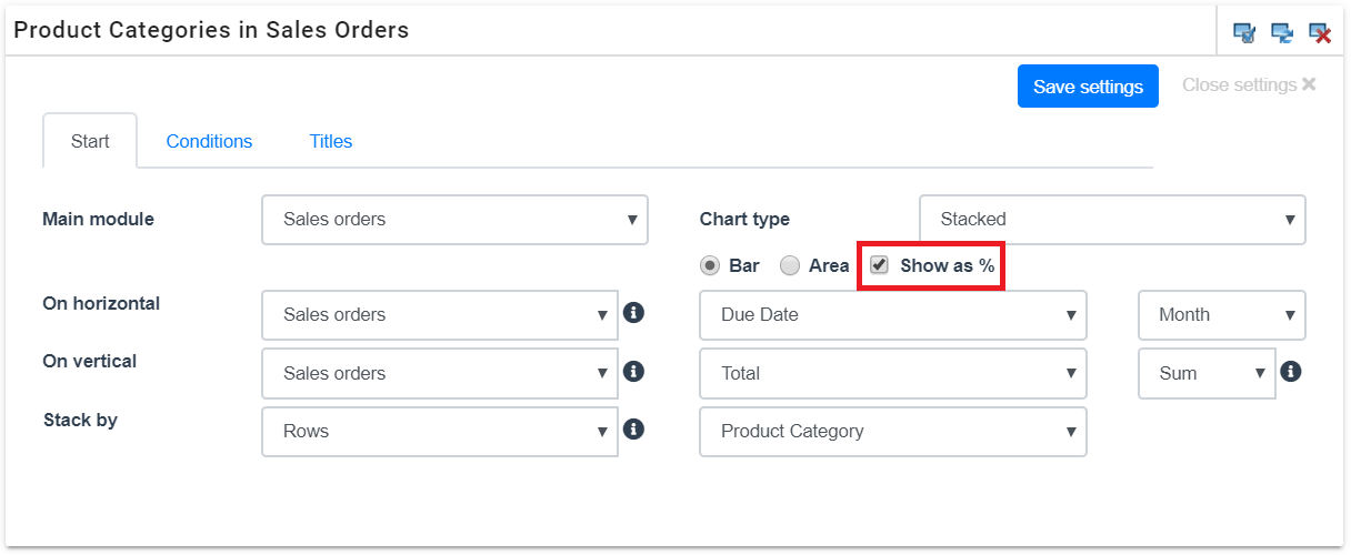
This guide represents an example case of a stacked percentage chart. A percentage chart is created in a same way as a “normal” stacked chart (for more information about creating stacked charts, see the guide Stacked Chart), but with using the additional setting Show as % (see the picture below).
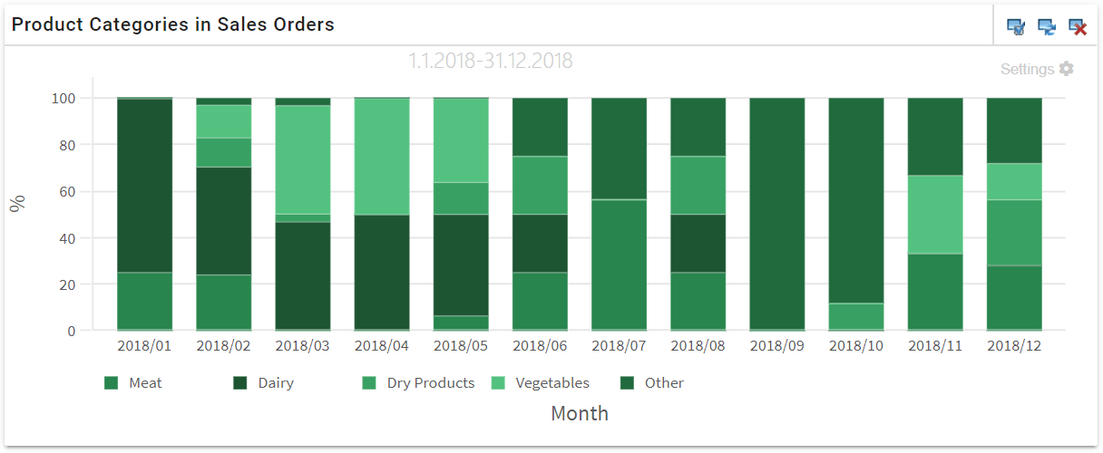
In this example case, we will create a stacked percentage chart that reports the percentage of each product category in the sales orders from the previous year. The sales orders are grouped by months by their due date. The combined grand total of the sales orders is stacked by the percentage of their rows’ product categories.
You can make the so-called normal stacked chart a percentage chart by activating Show as %. The percentage chart can also be presented as an area chart.
Conditions
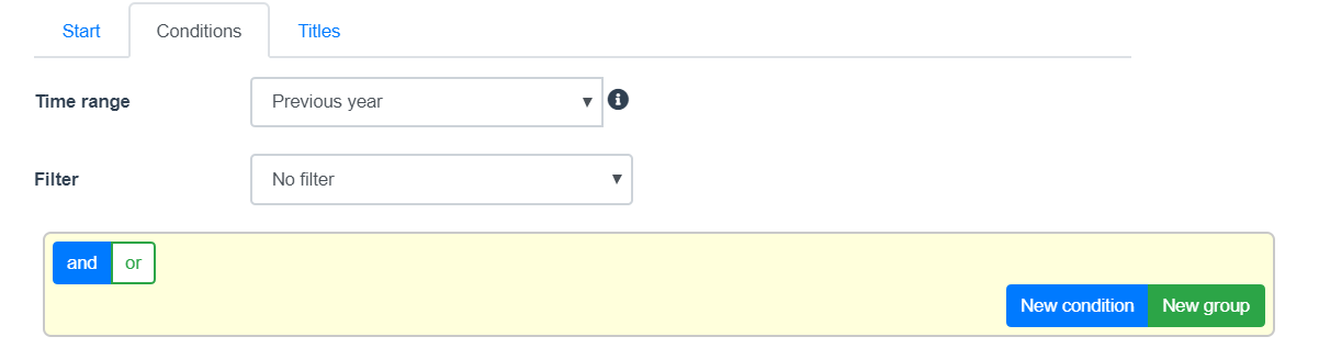
On conditions, we’ll select the previous year as the time range. No other limitations or filters are needed for this example.
Titles
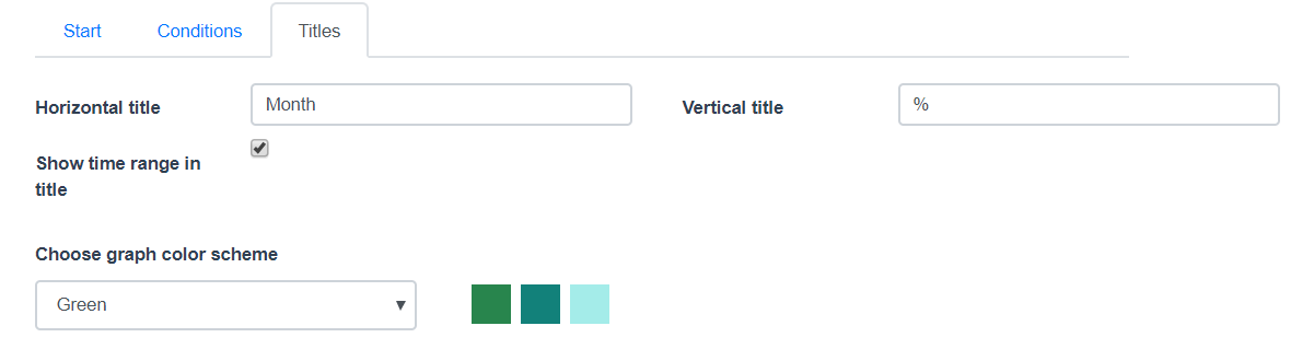
The horizontal and vertical titles are set appropriately, as well as the other additional settings.
Outcome
The outcome of this example is a stacked bar chart, whose bars are all stretched to 100% and broken down by the percentage of each product category.