General
In the survey editor, you can create the survey by adding the questions and adjusting the survey settings on the whole survey and each page separately. You can also customise the survey theme to personalise the layout of the survey. Each question can also have its own individual settings. We will now introduce the parts of the Survey Editor and briefly explain what the different parts do.
Survey Editor
The survey editor has everything you need to add questions to the survey. It is also used to control the settings of the survey and its questions. Users can also access layout and translation settings through the survey editor. In this guide, we go through all the functionalities on a basic level, but we have also included links to the in-depth guides for the features that deserve more detailed instructions.
Survey editor tabs
The survey editor has four tabs: Designer, Preview, Themes and Translations. You can easily switch between tabs by clicking them, and the active tab has bolded text and coloured underline (see picture below).

Survey Designer
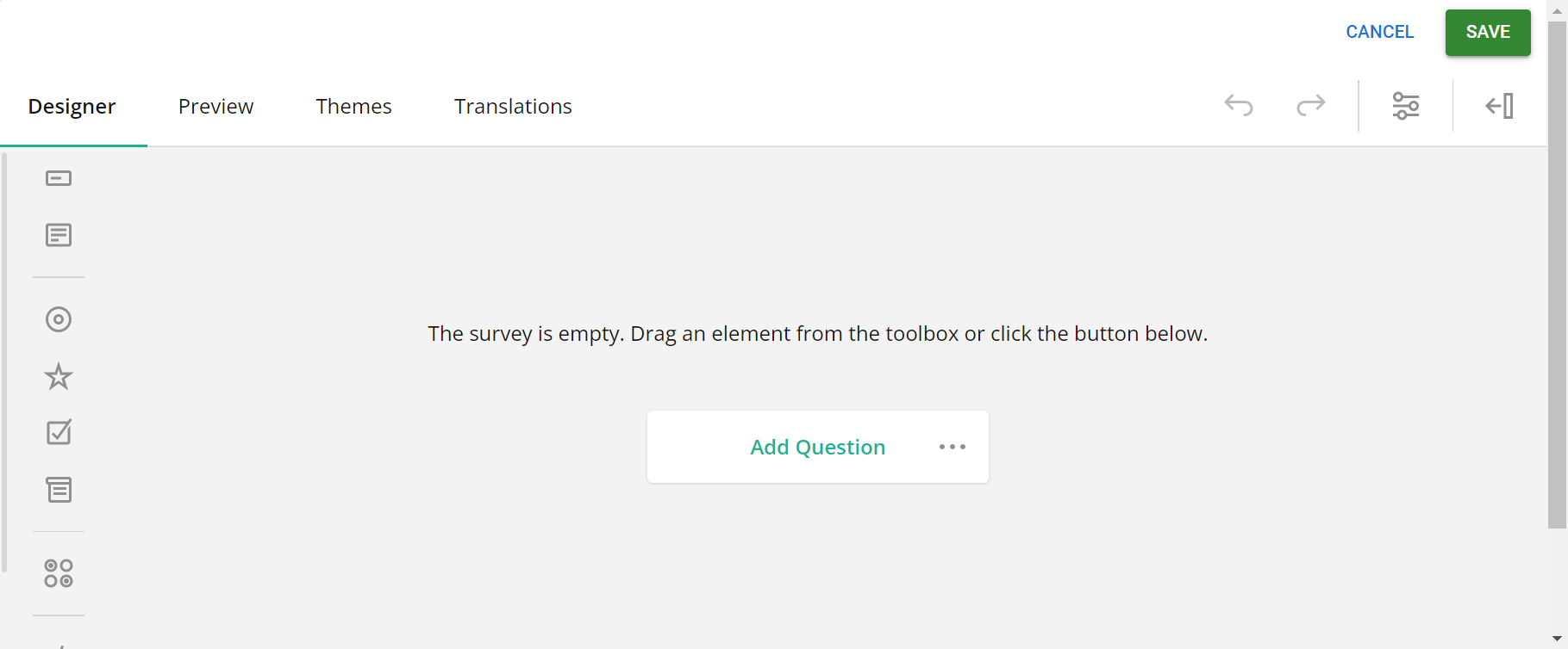
The survey designer is used to control the questions and their settings. It also has the general settings of the survey itself. The designer is the first view that opens whenever the Add/update survey option is selected. If the survey is empty, the user will get a notification text and on-screen instructions for adding questions (see picture below).
Adding elements to the survey
Survey element controls are located on the left side of the survey editor. Elements here can be dragged to the desired place, or users can click the desired element (or, when navigating with the keyboard, press Enter) to add it to the survey. Clicking and pressing Enter will add the element after the currently active element.
Dragging allows users to place the element precisely where they want, including side-by-side right away. When dragging and dropping, position the element in the desired place by following the line outside the element box (see the picture below).
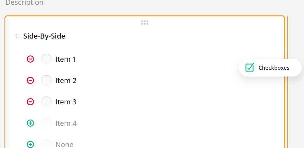
In the example image above, we are adding the Checkbox question on the right side of the Radio Button Group question, so we drag the Checkboxes question until the line appears on the right side of the Radio Button Group question and then release. Now questions appear side-by-side in the survey editor and in the final survey they will look like this:

Survey Designer Controls
In the top right corner under the Cancel/Save buttons user can find four control buttons (see picture below). When hovering the mouse over the icon the popup text will show the name of the icon.

The first two icons in the row are the Undo and Redo buttons. If you make a mistake, just press Undo to quickly erase it. If you undo a step by mistake, just press Redo to do the step again. One step can be anything from adding a question to settings modification, so to ensure that nothing unwanted is erased/added it is good to keep an eye on the affected part of the survey when these buttons are used.
The third icon acts as a shortcut to the survey settings. This means that no matter where you currently are in the settings area, pressing this button will return you to the general settings of the survey. When jumping to the general settings the functionality will also expand the settings panel if it is hidden (see picture below).
![]()
The fourth and last icon in designer control is the Show panel, which has its counterpart Hide panel (see picture below). While the Survey settings button always jumps to the general settings, using Show/Hide panel buttons remembers your location based on the rules of the editor and simply just toggles panel visibility.
![]()
Survey Element Controls
On the left side of the editor, we can see the survey element controls, which contain all the elements the user can add to the survey. These include different question types, HTML, images, etc.
Because the most common use of the editor is to add questions to the survey, in this guide we are mostly using the term question instead of element. This is because the default name for elements in the system is the word question followed by the number, so the first added element is named question1, the second is question2 and so on.
Depending on the user’s screen size, the view will either contain icons, as shown above, or icons and element names (see picture below).
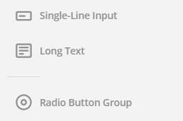
Questions can be dragged and dropped onto the survey. Simply clicking on the question (or pressing Enter on the keyboard) will add the question directly after the currently active question. If only icons are visible, hovering the mouse cursor over the icon will show the element’s name (see picture below).
![]()
Question settings
Each question has specific settings. Some of them are available in the question editing area (see picture below), but to access all possible settings users must use the settings panel.

In the example above the setting buttons are located under the question. The first picklist always shows the current question type (in this case Rating Scale), and this can be used to change the question type. The second picklist controls the input type of the question and this option is only available with Rating Scale and Single Input question types.
NOTE: Changing the question type of an already edited question might cause a loss of data. The amount of data loss depends on the scope of the change. For example, if changing from Checkbox question type to Single Input question type all choice options will be lost since Single Input does not use choice options. But when changing from Checkbox to Radio button question type the custom choices will remain intact since both question types use the Choices functionality.
Using the Duplicate option you can make an identical copy of the question and its settings. You can make the question required by clicking the Required option. Required questions will be marked with an asterisk *, and you can remove it from the question by clicking the Required button again. The Delete button removes the whole question and settings applied to it.
To learn more about element and question settings, read this guide.
Survey Settings
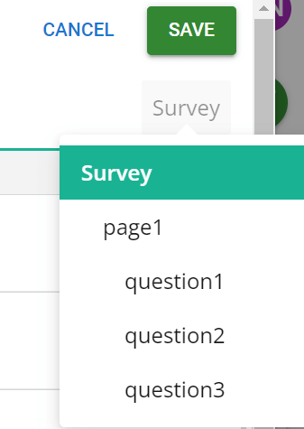
While the question settings vary depending on the question type, the survey settings stay the same. You can access the Survey settings by using the survey settings icon in the survey designer controls, or by using the settings picklist to select Survey. The picklist is located under the Save icon, which is visible if the settings panel is not hidden (see picture below).
The default view starts with the survey’s general settings, but there are nine different types of settings (see picture below). At the top of each type of setting is a search bar that can be used to find specific settings.
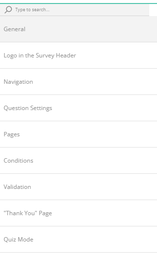
General settings control the title, description, and default language of the survey. Logo in the Survey header setting option lets you add a logo and specify its settings. Navigation settings allow you to customize how users navigate through the survey.
Question and Page settings are shared with every question and page of the survey. They should not be confused with individual question/page settings that are controlled by selecting the desired question/page from the settings picklist.
Conditions control custom variables and triggers, which can be used to execute different actions like ending the survey based on answers given to the survey. So if, for example, we want answers only from people over 18, it is possible to use Conditions to redirect all who answer under 18 as their age right to the survey “Thank You” page.
Validation settings determine which point is used to check if the required questions are answered. Thank You page settings allow you to change what users see after they have completed the survey. Quiz Mode settings allow you to turn a regular survey into a timed quiz.
Check this guide for an in-depth look at different survey settings.
Preview
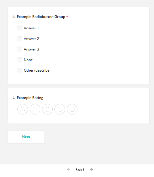
With the survey preview, it is possible to test the survey before sending it. This will show all parts of the survey the person answering is shown one page at a time (see picture below). This means it is easy to test the theme and all the other survey settings by using this tool. You can preview the survey as many times as you like, which is especially handy when testing that validation rules and other complex settings are working correctly.
Themes
Most of the visual elements of the survey can be edited by using the Themes tab. Users have ten ready-made themes they can use, or they can use the customisation options to adjust the look of the survey. Users can modify any readily available theme so a good starting point is to find a theme that resembles the wanted end result and start modifying it.
Survey theme General settings determine which theme is used, is the used theme Light or Dark and do the questions appear with or without panels (see the picture below). In the example picture, we are showing Layered theme, but every survey base has Default theme option selected at the beginning.
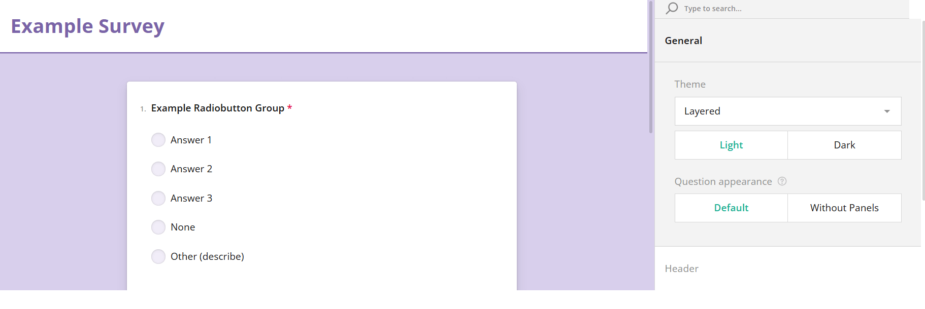
Theme header settings adjust the look of the header and the location of the possible survey logo. There are basic settings for font, but users can also use the advanced mode to edit the whole content and the content area from background to content positions.
Survey appearance is used at the basic level to control accent colours, panel and question box opacity, survey font family, font size, scale factor, etc. Users can also use the advanced mode to adjust multiple layout settings from error message colours to question backgrounds.
Check this guide for an in-depth look at different survey theme settings.
Translations
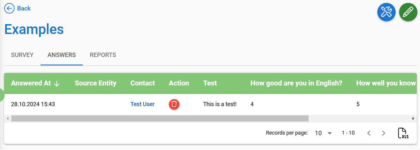
Survey translations can be added using the Translation tab. These settings are listened to by the CRM and the Self-Service Portal, so they affect how the survey is displayed in the Answers tab of the survey entity card (see picture below), or in the case of Mass Event Surveys, which language the user sees the questions in depends on the language settings of the Self-Service Portal. If the user is not logged in to the Self-Service Portal, the Mass Event Survey will be displayed based on the language of the user’s browser.
NOTE: When surveys are sent via email link, the language of the survey is determined by the default language of the survey at the time the recipient opens the link. This means that when there is a need to gather answers using multiple languages via email survey, each language version of the survey must be created separately. However, you can always create one survey containing all the translations and copy the survey using the module tool Link to another module. Then all you have to do is to switch default language so you can send out different translations.
