Long Text
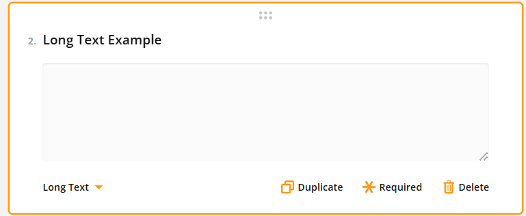
This text box allows for the entry of lengthier and more comprehensive information by providing a larger area for typing. This is suitable for open-ended questions allowing longer answers, like customer feedback (see picture below).

Radio Button Group
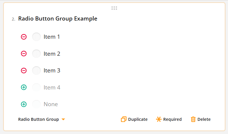
This question type allows respondents to select one option from multiple choices using circular buttons. This feature is suitable for questions that have only one correct answer such as Yes/No questions. Settings offer customisable items that can be removed with the minus button and added with the plus button (see picture below).

Rating Scale
In this question type respondents choose a number from a given set of numbers. This option is best for questions that ask for a rating or score. In addition to numbers, you can use graphic symbols (like stars or emojis) for rating values, and the number of values can be edited by using the plus and minus buttons (see picture below).

Checkboxes
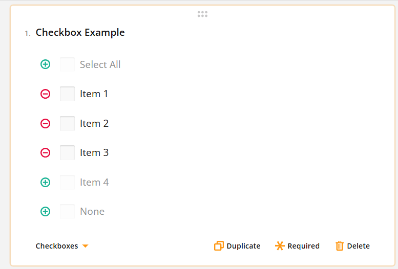
With this question type the respondents can choose one or more responses by clicking on small boxes next to the options (see the picture below). This feature is useful for questions that permit selecting multiple answers such as when inquiring about personal interests or preferences. Use the plus and minus buttons to add/remove answers.

Dropdown
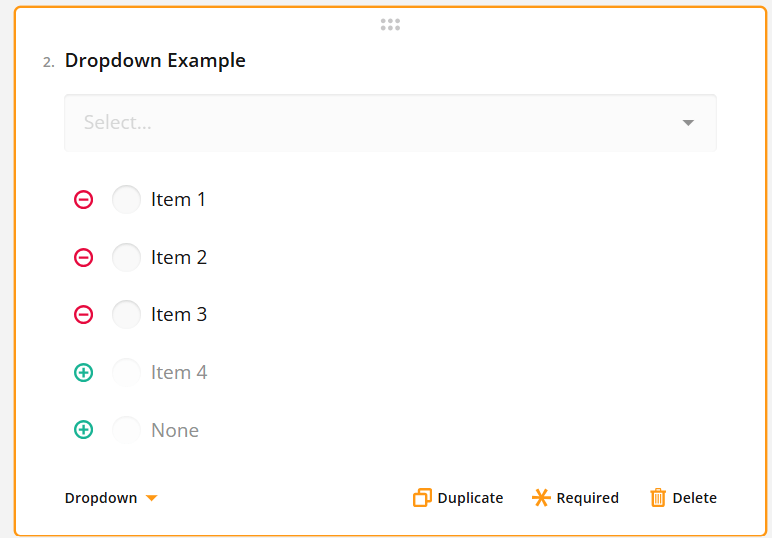
In this question type, respondents select one option from a list of choices. Like the Radio Button Group, this type is appropriate for questions with one allowed answer, but it takes up less space by compiling the options into a picklist. Options can be added/removed by using the plus and minus signs (see the picture below).

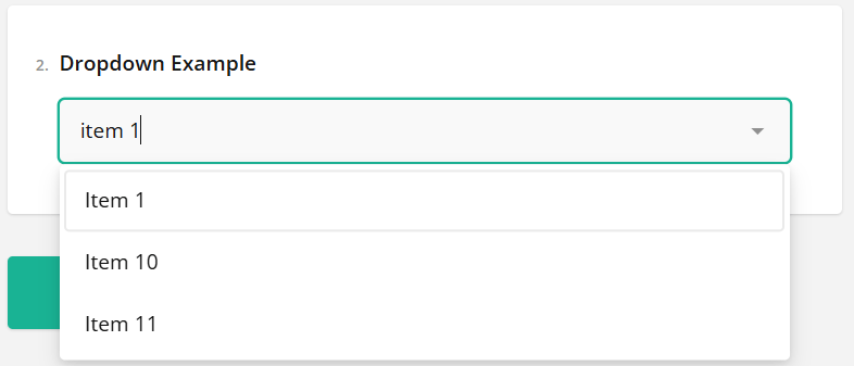
When the user answers the question the field doubles as a search bar, allowing a large amount of options without the loss of usability (see the picture below).

Single-Select Matrix
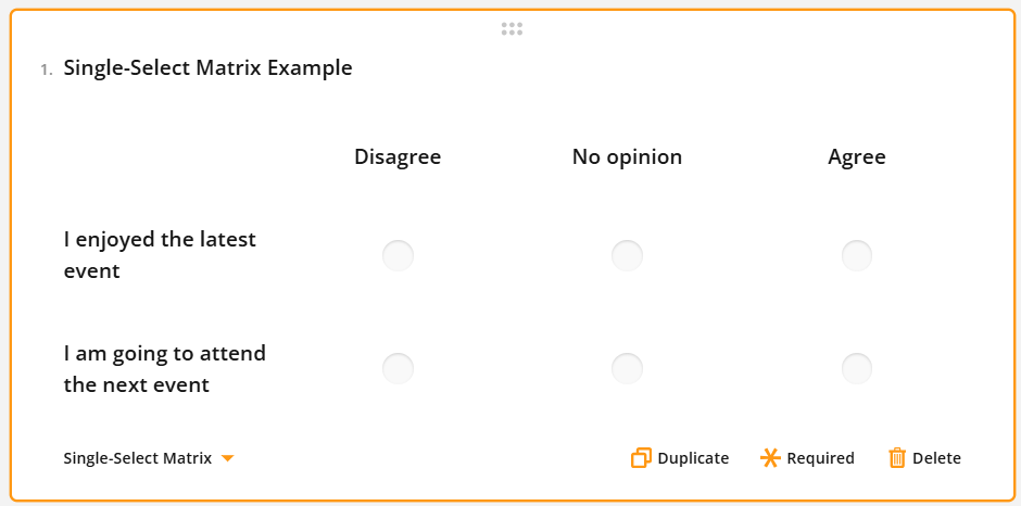
A Single-Select Matrix displays multiple choice options in a grid format. Each row has a set of radio buttons and the respondent can select only one option per row. This question type can, for example, be used with feedback questions where rows are statements and with columns users can select how much they agree with the statement (see picture below).

HTML
This input type is a specific type of element containing the HTML markup box. This allows users to enter HTML to insert text. This input type is solely for presentation purposes and does not generate a value that can be included in survey results.

Expression
This type of question is for performing calculations and showing the results to the survey respondents. It allows you to add up scores from previous responses, display the current date and time, or calculate averages. The calculated values are stored along with the survey data.
To create a calculation, enter the formula in the “Expression” field (see picture below). You can reference other questions in the survey if needed (for example {question1} + {question2}). More detailed information about creating calculations can be found in the article Surveys – Question and Element Settings.

Image
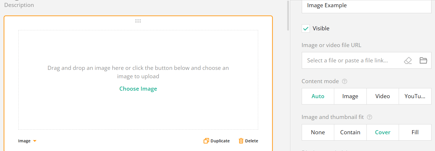
Images and videos can be added to a survey through links or file uploads. This feature is for visual presentation purposes only and does not affect the survey responses.
