General
Surveys support ten elements — seven question types and three special elements. In this guide, you’ll learn how to add these to the survey and see examples of the most common use cases for each element. To learn more about the Survey editor, check the guide Survey Editor. For more information on the different question and element settings, see the guide Question and Element Settings.
Single-Line Input
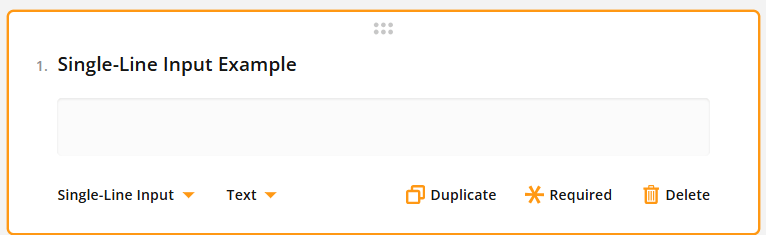
The Single-Line Input is a box where people answering the survey can type in information using just one line. These boxes are often used for entering short pieces of information like names email addresses, phone numbers, or other text.
By default, Single-Line Input questions are added as the type Text, but it can be easily changed using the settings or picklist located at the bottom of the answer box (see picture below).
Long Text
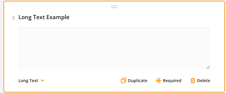
This text box allows for the entry of lengthier and more comprehensive information by providing a larger area for typing. This is suitable for open-ended questions allowing longer answers, like customer feedback (see picture below).
Radio Button Group
This question type allows respondents to select one option from multiple choices using circular buttons. This feature is suitable for questions that have only one correct answer such as Yes/No questions. Settings offer customisable items that can be removed with the minus button and added with the plus button (see picture below).

Rating Scale
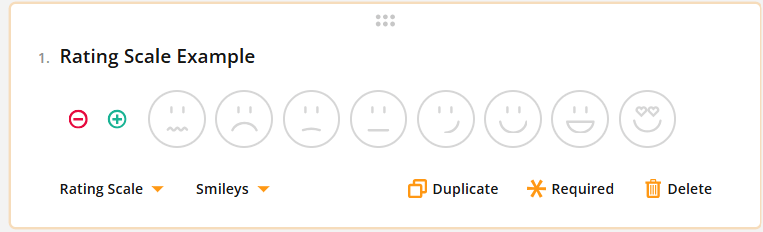
In this question type respondents choose a number from a given set of numbers. This option is best for questions that ask for a rating or score. In addition to numbers, you can use graphic symbols (like stars or emojis) for rating values, and the number of values can be edited by using the plus and minus buttons (see picture below).
Checkboxes
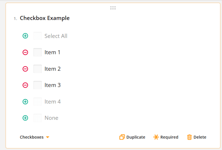
With this question type the respondents can choose one or more responses by clicking on small boxes next to the options (see the picture below). This feature is useful for questions that permit selecting multiple answers such as when inquiring about personal interests or preferences. Use the plus and minus buttons to add/remove answers.
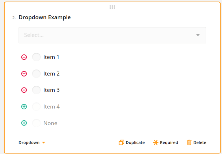
Dropdown
In this question type, respondents select one option from a list of choices. Like the Radio Button Group, this type is appropriate for questions with one allowed answer, but it takes up less space by compiling the options into a picklist. Options can be added/removed by using the plus and minus signs (see the picture below).
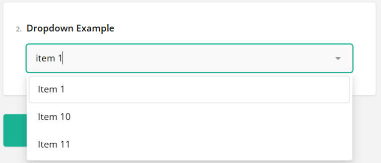
When the user answers the question the field doubles as a search bar, allowing a large amount of options without the loss of usability (see the picture below).
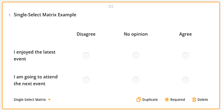
Single-Select Matrix
A Single-Select Matrix displays multiple choice options in a grid format. Each row has a set of radio buttons and the respondent can select only one option per row. This question type can, for example, be used with feedback questions where rows are statements and with columns users can select how much they agree with the statement (see picture below).
HTML
This input type is a specific type of element containing the HTML markup box. This allows users to enter HTML to insert text. This input type is solely for presentation purposes and does not generate a value that can be included in survey results. You can read more about the topic in the guide Use of HTML Element in Surveys.
Expression
This type of question is for performing calculations and showing the results to the survey respondents. It allows you to add up scores from previous responses, display the current date and time, or calculate averages. The calculated values are stored along with the survey data.
To create a calculation, enter the formula in the “Expression” field. You can reference other questions in the survey if needed (for example {question1} + {question2}). More detailed information about creating calculations can be found in the article Surveys – Question and Element Settings.
Image
Images and videos can be added to a survey through links or file uploads. This feature is for visual presentation purposes only and does not affect the survey responses.
Surveys – Frequently Asked Questions
Can I edit the style of the survey?
In the survey Theme settings, you can edit multiple style settings like fonts, backgrounds, etc..
Does the survey scale for mobile devices?
Yes, the survey will scale for mobile use, and you can use the preview settings to check how it will look on different devices.
Can I use a template when creating a survey?
Survey Editor has a few ready-made theme templates for easy-to-use layout settings. You can also make a survey you like and then copy it by using a module tool [insert link]. It is also possible to order a special template made by us for you by contacting our support.
Can I edit the survey after it has already been sent?
Editing the survey is always possible on the surface level, assuring that respondents will get perfect survey. This means that question title and answers visible to receivers can be edited at any time. However to avoid logical errors the values related to question and its answers will be locked from edits after there has been at least one answer to the survey.
How many times users can answer the same survey?
Survey answers are limited to one per sent link to automatically prevent multiple answers for the same survey. If there is a need to receive multiple answers from the same person, using a new email with the survey link does the trick.
Can I edit the survey answers tab to organise the answer data the way I want?
The Survey Responses tab only allows you to view the responses and organise them by date. However, you can always use the Excel export feature to get the answers into the Excel spreadsheet where you can sort, organise and edit them as you wish.
Is it possible to see the answers in the form of graphs?
Where possible, the Survey Responses tab will display the responses to the question using a doughnut or bar graph. This feature is available for all fixed answer question types, but not for open-ended questions such as text answers.