General
In this guide we go through all possible settings the users have when adding questions and elements to the survey. To learn more about the Survey editor, check the guide Survey Editor. Surveys support ten elements — seven question types and three special elements. Each question and element has special settings that can be modified. These should not be confused with the Question settings found in the Survey General Settings that affect all the questions in the survey. For more information on the different questions and elements and their use cases, see the guide Question and Element Types.
Questions Settings
All questions share the same setting buttons located in the bottom-right corner of the question. Three special elements are different and have their unique set of settings, so at first we only explain settings shared by seven different question types.
The Duplicate option duplicates the question and all settings attached to it. Pressing Required settings marks the question required, and pressing the button again toggles the requirement off. Required questions are marked with an asterisk *. Pressing Delete will remove the question and all the settings.
If you delete a question after the survey has already received answers, the answers are deleted as well. Our suggestion is not to delete questions. Unwanted questions can be hidden from the survey by unchecking the Visible setting in the questions settings panel.
Shared General Settings
The buttons under question offer a very limited amount of settings. All question settings can be found in the Question Settings panel which can be accessed by selecting the required question from the Settings drop-down menu or by clicking on the question in the Editor view. Questions share a set of settings like Question name, title and description.
The difference between the Question name and the Question title is that the name is for internal use, while the title is displayed to the respondent.
To avoid logical errors in surveys, internal values (question name etc.) will be locked from edits after there has been at least one answer to the survey. Values visible to the respondent (question title etc.) will remain editable, allowing users to correct typos etc. if necessary.
The Description is always visible to the respondent and can be used to give them more information about the question. By checking or unchecking the Visible and Required boxes, you can determine if the question is visible in the survey or if it is a required question that cannot be skipped.
Most of the questions also have both CRM Connect Field and Prefill from the field settings. Because prefilling from the field requires the question to be compatible with the CRM information, it is not available in all the question types.
CRM Connect Field determines which field in the respondent’s entity card in the CRM is filled or overwritten by the answer the user gives. Prefill from the field fills the information from the CRM to the survey if there is information in the specified field.
In the picture above we have selected the CRM Connect Field to be Email, and it is prefilled from the field Email as well. So, for example, if the email of the respondent is example@mail.com, the answer field has prefilled example@email.com as an answer. However, since the CRM Connect Field also overwrites the field information, if the respondent deletes the prefilled answer and writes instead that their email is thisisanexample@mail.com, the example@email.com will be replaced with thisisanexample@mail.com in the CRM.
Shared Layout Settings
All questions share three different layout settings. Display the question on a new line setting is on by default, meaning that all the added questions are added into their own line at the beginning. To show questions side-by-side, you can simply uncheck this box and the question will jump one line higher next to the question before it. However, since the first question is already at the top line of the page, this setting does not affect the first question of the page.
By using the settings Minimum question width and Maximum question width users can use CSS options (px, %, pt, etc) to control the size of the questions. In the above example picture the minimum question width is always 300px, and the maximum is 100 % of the width of the survey. If we, for example, change the maximum width to 50%, the question will always fill just half of the survey’s full width.
Shared Condition Settings
Conditions are rules that determine how the question behaves during the survey. Conditions have several different parameters that are applied either by manually typing them into the text box or, if available, using the magic wand tool. When questions and their answers are used in the parameters, the question name and answer value are used. We suggest that question names and answer values are named by the user, as using values such as question1 and item 1 can make conditions harder to read.
Some conditions require specific question types, but six conditions are shared with all question types. In the Conditions settings after each condition, there is a small question mark, and hovering the mouse over it reveals instructions for the specific condition. Some conditions have a magic wand next to them, which is used to determine the rules for that condition.
Make the question visible if is the condition that determines the situations in which the respondent sees the questions. This is particularly useful if we want to use ‘other’ as an answer, but also want respondents to specify what ‘other’ means. To do this, we simply create the question and use the magic wand to set the condition that our question becomes visible if the answer value of the question is ‘other’.
Make the question required if is the condition that determines the situation in which the question becomes required. The logic here is identical to the Make the question visible if condition, but instead of toggling the visibility of the question, we toggle the requirement of the question.
The Default value expression can be used to pre-fill the answer with a specific value. The respondent can always change the answer, but this is an easy way to make the respondent’s experience with prefilled answers smoother. For example, if we want to set the answer to a date-type question as the day the respondent gives their answer, we use the default value expression today() to pre-fill the answer.
Reset value if is the condition that can be used to reset the pre-filled question values based on certain conditions. This works in cases where Default value expression, Default value or Set value expression is used to pre-fill the field with information. When this option is used, when the conditions are filled the pre-filled answer will be deleted from the answer field.
The Set value if determines conditions where the Set value expression is executed to pre-fill the answer field. If the Set value expression is empty, this option does nothing. The Set value expression determines what is pre-filled in the field when the Set value if condition is used.
The following example shows how the Reset and Set Value conditions work. In this example, we want to calculate how many years and months the respondent has been a member. If the respondent has been a member for less than a month, they should fill in the number of days manually.
To do this, we use three questions. Have you been member for over a month? is a Yes/No question named over-month-check. When did you become a member? is a date-type question named since-date. The last question asks the respondent How long have you been a member? and pre-fills the answer using years and months if they have answered Yes when asked if they have been a member for over a month. All the conditions are set in the question number three (see picture below).
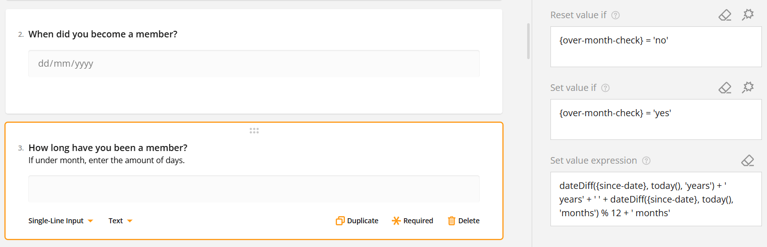
So if the respondent answers that they have been a member less than a month {over-month-check} = ‘no’, the answer to the question “How long have you been a member?” will not be pre-filled.
However, if they answer yes to the same question so {over-month-check} = ‘yes’, then the duration of their membership is calculated in the question number three after they have set the date using question number two.
In this example, we have used the value
dateDiff({since-date}, today(), 'years') + ' years' + ' ' + dateDiff({since-date}, today(), 'months') % 12 + ' months'
to get the answer in years and months, but Set value expression condition supports multiple different input types, making it a versatile tool.
Setting the Conditions with the Magic Wand
When the Magic Wand is available, users can easily set up conditions without needing to type the parameters. For example, we might have a question about how many times the respondent has attended one of our events, and after that, we want feedback from our events. The rating question is redundant if the answer to the previous question is zero. So, we open the rating question conditions and use the magic wand.
First, we use Select… picklist to find the question asking how many times the user has attended our events. Then because we want everyone else except the persons answering 0 to see the question, we use the Any of -condition and select all options except option 0. There is an option to add more conditions, but since we need only one in this example we can press apply to save.
Now the condition is neatly filled in the question settings. The condition can be edited inside the text box or by clicking the magic wand again.
Question Validation Rules
Each question also has its own validation rules apart from required question validation, which is determined in the General settings of the question. When using question Validation rules you can specify what type of answer the user has to give for an acceptable answer. Here you can also give the required question a special error message, which replaces the default message “Response required”. You can add a new validation rule by pressing the + icon or selecting Add a new rule in the Validation rules box.
So in the following example, we want to know which day of the month the user was born. Because every month has at least one day and a maximum of 31 days, we can use the settings to limit answers to numbers 1-31.
So we use Validation type Number, and our Minimum value is set to 1 and Maximum value is set to 31 and add error message: “The value should be at least 1 and at most 31”.
So now, if the user for example answers 32, the validation check does not accept the answer and gives the error message “The value should be at least 1 and at most 31” message instead.
Element settings
In addition to the questions, Surveys also have three special elements. These elements are HTML, Image and Expression. Each of these types have their own specific settings.
HTML
HTML can be used to insert multiple things in the survey. For example, you can insert a link by using the following HTML markup:
<a href=”your website address between these brackets”>What you want link to say comes here</a>
So if for example, we want to make the link to the page resources.crmservice.com with the text Check our resources page for more information, we would insert the following HTML markup to the HTML element settings:
<a href=”resources.crmservice.com”>Check our resources page for more information</a>
And when the settings above are saved in the survey, the end user will see hyperlink that reads “Check our resources page for more information”
The appearance of the HTML markup result in the survey is a combination of the HTML markup and the survey’s visual settings, so changing the theme, for example, may alter the appearance of the end result.
Image
The image element can be used to add images and videos (including YouTube videos) to the survey by either inserting the file link or uploading the file to the system.
At first, the user is greeted with two set of options. Content mode is used to state the format of the content. The Auto option automatically detects the format based on the provided link, but the format can also be selected manually.
Image and thumbnail fit options determine how the image or video thumbnail fills the element. If none is selected, it stays in its original size. Contain resizes the image to fit the area while maintaining the aspect ratio of the image. Cover makes the image fill the area while maintaining its aspect ratio, while Fill just fills the space using the image and does not maintain the aspect ratio.
With settings, users can also determine the height and width of the image display area and set up the alternative text to enhance accessibility and explain the content in situations where respondents’ devicess are not able to display the content.
Expression (read-only)
Expressions are a way to do calculations using the information given by the user or set values. They are used to show the calculated results in a form or survey. Expressions are read-only which means the user cannot directly change or enter values into them.
So let’s say that we want to know how long a person has been a member, but we don’t want them to edit the field. We use the same parameters as in the Set value expression example:
dateDiff({since-date}, today(), 'years') + ' years' + ' ' + dateDiff({since-date}, today(), 'months') % 12 + ' months'
We set the Expression description to “Congratulations! You’ve been member for” and set is visible. Then we insert the parameters above to the expression field.
And now when the respondent answers “When did you become a member?” question, our read-only expression calculates how long they have been a member and displays the information. So for example, if user has been member for 3 years and 8 months, the message shown is “Congratulations! You’ve been member for 3 years and 8 months”
Surveys – Frequently Asked Questions
Can I edit the style of the survey?
In the survey Theme settings, you can edit multiple style settings like fonts, backgrounds, etc..
Does the survey scale for mobile devices?
Yes, the survey will scale for mobile use, and you can use the preview settings to check how it will look on different devices.
Can I use a template when creating a survey?
Survey Editor has a few ready-made theme templates for easy-to-use layout settings. You can also make a survey you like and then copy it by using a module tool [insert link]. It is also possible to order a special template made by us for you by contacting our support.
Can I edit the survey after it has already been sent?
Editing the survey is always possible on the surface level, assuring that respondents will get perfect survey. This means that question title and answers visible to receivers can be edited at any time. However to avoid logical errors the values related to question and its answers will be locked from edits after there has been at least one answer to the survey.
How many times users can answer the same survey?
Survey answers are limited to one per sent link to automatically prevent multiple answers for the same survey. If there is a need to receive multiple answers from the same person, using a new email with the survey link does the trick.
Can I edit the survey answers tab to organise the answer data the way I want?
The Survey Responses tab only allows you to view the responses and organise them by date. However, you can always use the Excel export feature to get the answers into the Excel spreadsheet where you can sort, organise and edit them as you wish.
Is it possible to see the answers in the form of graphs?
Where possible, the Survey Responses tab will display the responses to the question using a doughnut or bar graph. This feature is available for all fixed answer question types, but not for open-ended questions such as text answers.