General
Theme editor allows users to use and edit different themes, so the surveys represent the wanted brand or look. The editor has basic and advanced settings, which we will explain in this guide. It is good to note that you are not able to adjust the look of the element if it is not present in the survey. For example, before you enter the title of the survey, you are unable to adjust the Survey title settings. CRM-service is also happy to offer customers pre-made templates in case there is a need to always use specific layout settings. If you are interested in getting a custom template, please contact our support team.
General Theme Editing Tools
Theme editor has multiple different setting types, but there is also a common set of tools used in a wide variety of these settings. These include things like colour picker and opacity selector. We now go through these universal setting tools, and later in this guide, we will then just mention them by name.
Colour Picker
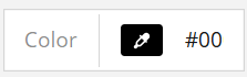
On many occasions, the colour settings are determined by using the colour selector setting (see picture below). In some cases, you can also see a picklist that lets you pick from a set of popular colours, but the colour picker and HEX code input field are present in all settings.
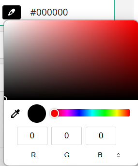
Colour can be edited by entering the HEX code manually or by using the colour picker to select the wanted colour. The HEX colour input field can be fully visible or cropped to fit it in the settings block, but you can edit it by clicking anywhere in the field. In the colour picker, you can either pick the wanted colour by clicking it with the mouse, or you can manually input RGB values (see picture below).
Opacity Settings
Element opacity determines the transparency of the element related to its background. Opacity 100% means that the element is fully visible, while 0% means that it is not visible at all. Opacity settings can be inserted by typing the percentage to the field, or when available, by using down and up arrows to adjust the value.
Background plays a part in the final result, so for example, using 50% transparency with a black font on a white background or with a white font on a black background both give a grey font as a result (see picture below).

Theme General Settings
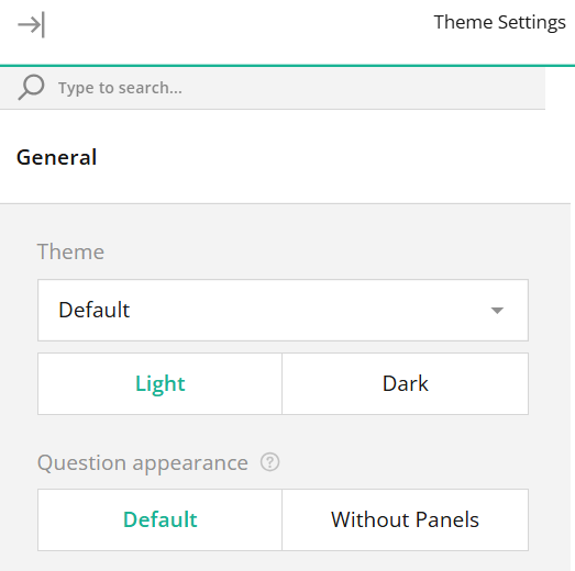
n the general settings of the Theme, you can use a picklist to pick one of the ready-made themes. You can either use the theme as it is or edit it. Each theme also has Light and Dark modes. Light mode is always the default, but you can switch to the dark colour scheme by pressing activating the dark mode under Theme settings (see picture below).
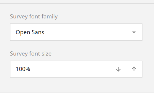
Survey Fonts The themes tab allows you to edit the survey fonts. Each font type can be adjusted separately, but in the Basic Appearance settings, you can adjust font family and font size settings on a survey level (see the picture below).
Survey-wide settings affect all fonts that have not been separately adjusted. So, for example, if we have specified that in one question font family is Times New Roman, that setting stays even if we change the survey font family to Arial.
Specific Font Settings
In the specific font settings users can edit font family, style, colour, opacity and size (see the picture below).
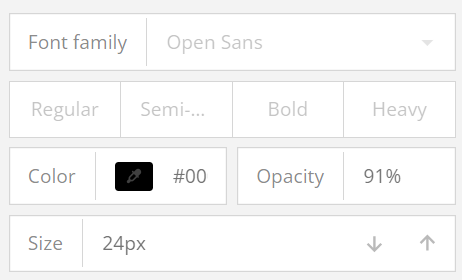
Styles from Regular to Heavy adjust how thick the selected font is. All fonts do not support all the styles, so when unsure, it is good to always keep an eye on the text the font you are editing affects. You can also specify the font colour and opacity in the settings. Font size is edited in pixels, and the number can be adjusted by writing it on the field or using the down and up arrows to make it smaller or larger.
Theme Background Settings
In the Background settings of the survey, you can set up and customise the survey’s background image (see the picture below).
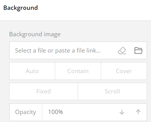
In background image settings you can either upload an image by clicking on the Folder icon or paste a link to an online image in the provided input field. Once your image is uploaded or linked, you can select a display style. The “Auto” setting maintains the image’s original dimensions and aspect ratio, tiling it if it’s smaller than the survey container. The “Contain” option resizes the image to fit within the container while preserving its aspect ratio, also applying tiling if necessary. The “Cover” option allows the image to fill the entire container, retaining its aspect ratio. Further customization options allow you to control how the image behaves as users scroll through the survey. By activating the Fixed position toggle, the background image will remain stationary, creating a fixed backdrop effect as the content scrolls over it. Alternatively, selecting Scroll will make the background move along with the survey content. Finally, to adjust the image’s transparency, use the Opacity property, which enables you to set the degree of visibility for the image.
Survey Header Settings
In the Basic mode of the survey header settings, users can adjust the title and description fonts on a basic level. They can also adjust the survey logo alignment if the logo is set up in the survey’s general settings. You can read more about the general settings of the survey in the article Surveys – General Settings. In the advanced mode of the survey settings user gets more settings for both information and the logo. They can also adjust the content area height and select the height displayed on the smartphones (see picture below).
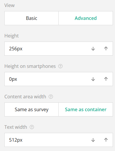
Content area width determines does the header’s content width follows the width of the survey or the width of the container. The first option matches the width of the survey while using the Same as container option automatically adjusts the content area width to match the space where the survey’s contents are displayed. The Text width option adjusts the width of the header area that contains the survey title and description. The adjustments are made by typing in the wanted pixel value into the field or by using the down and up arrow to adjust the value.
Survey Header Background Settings
The background of the survey header settings gives the user the opportunity to give the header a more personal look. This can be done by editing the background colour and by using the background image (see picture below).
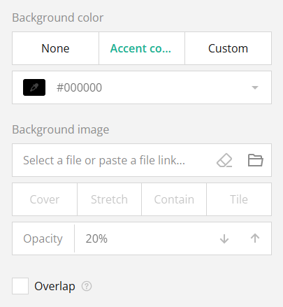
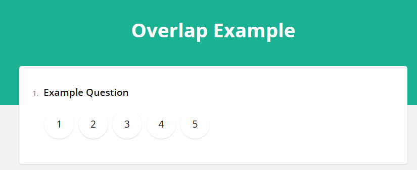
Header background colour settings have three options – none uses the background colour determined by the base theme used. Accent colour uses the survey’s accent colour. The Accent colour is adjusted in the survey’s Appearance settings. Selecting the Custom setting activates the colour picker and other colour input options. In background image settings you can either upload an image by clicking on the Folder icon or paste a link to an online image in the provided input field. Once your image is uploaded or linked, you can select a display style. The “Cover” setting maintains the image’s aspect ratio and fills the whole header area. The “Stretch” option fills the header box with the image, stretching the image while maintaining its aspect ratio. The “Contain” option resizes the image so it will fit the header box, retaining its aspect ratio. If the image is smaller than the header box, the background fills the remaining area. The “Tile” option repeats the image to fill the whole header box while maintaining its aspect ratio. Checking the Overlap option active will make the survey partly overlap with the header (see picture below).
Background colour does not matter if the background opacity is set to 100%, but the lesser the opacity, the more the background colour is visible behind the image.
Survey Header Content Alignment Settings
In the survey header advanced settings users can also find alignment settings for logo, survey title and survey description. The Left, Center and Right options control the horizontal alignment, while the Top, Middle and Bottom control the vertical alignment (see the picture below).
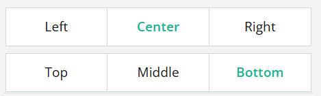
In the settings above (Center & Bottom) we can put the header in the center of the survey and the bottom part of the header. These settings are demonstrated in the Overlap Example image in the previous chapter.
Survey Appearance Settings
The basic survey appearance settings allow users to customise accent colour, survey element transparency, font settings, survey scale factor and survey corner radius. By toggling the advanced options user will get even more options for each of these, and additional settings to the page, question boxes, etc.
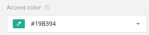
Survey Accent Colour
The accent colour of the survey is the colour used when highlighting the survey’s key elements like title, currently focused field, and selected choice. In basic settings, accent colour is determined by using the colour selection box containing a colour picker, HEX input field and picklist (see picture below).
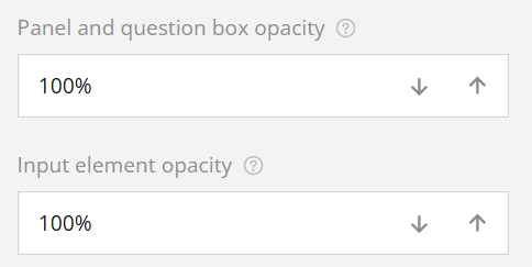
Survey Element Opacity
The panel and question box opacity setting adjusts how transparent the panels and questions are related to the survey’s background. The same type of setting is available to the input elements like text boxes and the background of radio group buttons (see picture below).
Survey Scale Factor Settings
Using the survey scale factor settings, it is possible to adjust the size of the survey’s elements. Adjust the value by entering the wanted percentage into the field, or by using the down and up arrows to set the value.
The survey scale factor can go over 100%. When adjusting scale factor settings, it is good to test the survey afterwards to ensure that it retains its readability.
Survey Corner Radius Settings
In the basic survey appearance settings, adjusting the survey corner radius setting will affect all rectangular elements of the survey. The value is adjusted in pixels and 0px means sharp corner. The higher the number, the rounder the corner. Users can either type the value in the input field or use the arrows to edit the value.
If users want to adjust the corner radius for the rectangular elements individually, this can be done in advanced settings.
Surveys – Frequently Asked Questions
Can I edit the style of the survey?In the survey Theme settings, you can edit multiple style settings like fonts, backgrounds, etc..
Can I edit the survey after it has already been sent?
Editing the survey is always possible on the surface level, assuring that respondents will get perfect survey. This means that question title and answers visible to receivers can be edited at any time. However to avoid logical errors the values related to question and its answers will be locked from edits after there has been at least one answer to the survey.
Take the Quiz
Glossary
- Accent Colour
- A specific color used to highlight key elements of the survey, such as titles and selected fields.
- Colour Picker
- A tool in the theme editor that allows users to select colors for survey elements, either through a visual interface or by manually entering HEX or RGB values.
- Corner Radius
- Adjustments that affect the roundness of the corners on rectangular survey elements. 0px means sharp corners while higher pixel values create rounder corners.
- Element Opacity
- Refers to the transparency adjustments made to specific elements within the survey, impacting how they appear against the background.