General
With the CRM home page’s Chart elements, you can create graphical (or in table format) reports on the user’s home page. The charts have extensive setting options, so that you can determine the perspective for the report very carefully to meet your needs. The charts can be user-specific or you can share them with the users of a certain sales group.
Chart Types and Common Features
There are several different chart types for different needs, including the traditional bar charts as well as reports in table format:
- Bar chart
- Line chart
- Pie chart
- Stacked – a bar chart, in which the bars are stacked by some information
In all chart types (excluding tables), it is possible to use drilling down, which means that by clicking a single bar/dot on a line/slice/etc. you can see a list of the entities that make up that bar/slice/etc.
Creating charts
Creating charts on the homepage is done by editing the dashboard view, the basics of which are explained in a separate article Dashboard Management.
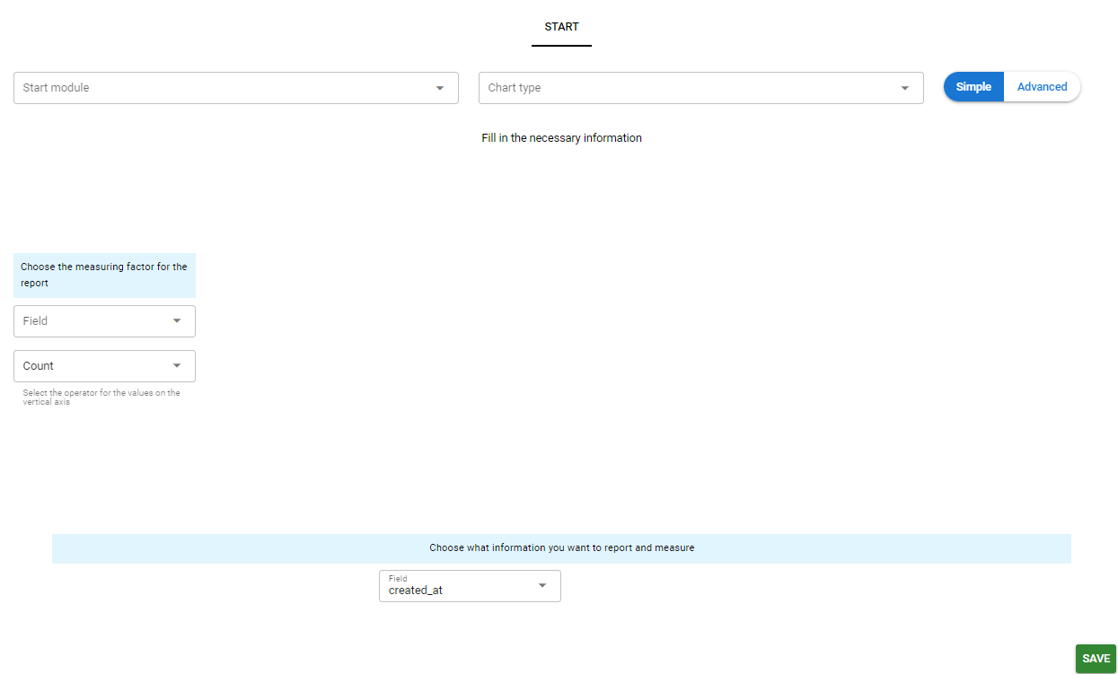
Start
When a user starts creating a chart, only the Start tab is initially visible in the editor. In this tab, the user sets the basic settings for the chart, such as the start module, chart type and report dimensions. The Easy/Advanced buttons control how many settings the user can directly influence.
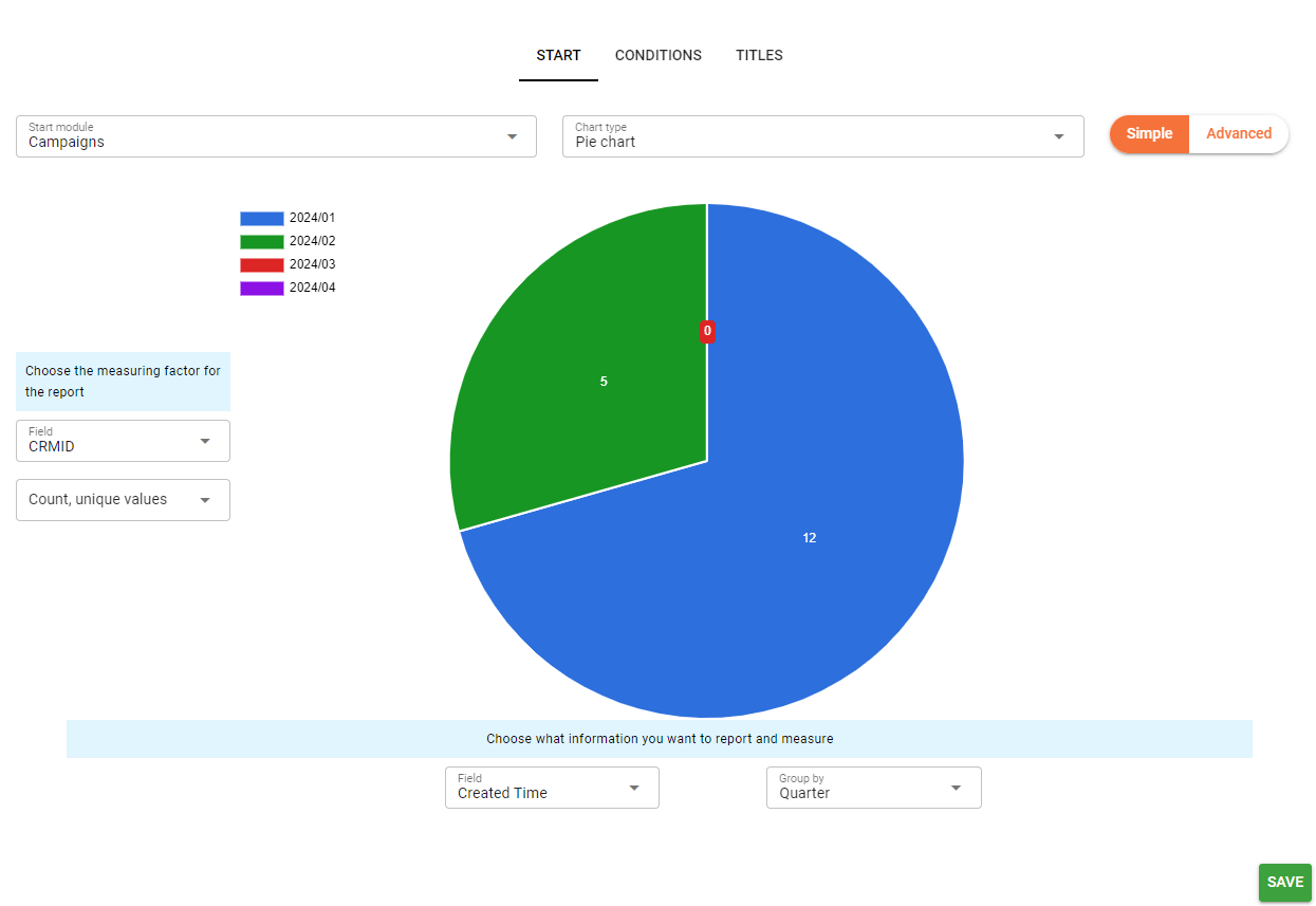
Preview
When the initial module and type are selected for a chart, the Conditions and Titles tabs also appear in the editor. When the chart is given a measurement coefficient and information about what is to be measured, the user will also see a preview of the chart. This preview mode, which updates based on the user’s choices, makes it easier to create charts by allowing the final appearance of the chart to be viewed before it is saved.
Bar and line charts can be compared, which is easily done by filling in the information in the comparison menu on the right side of the chart to define the conditions for comparison.
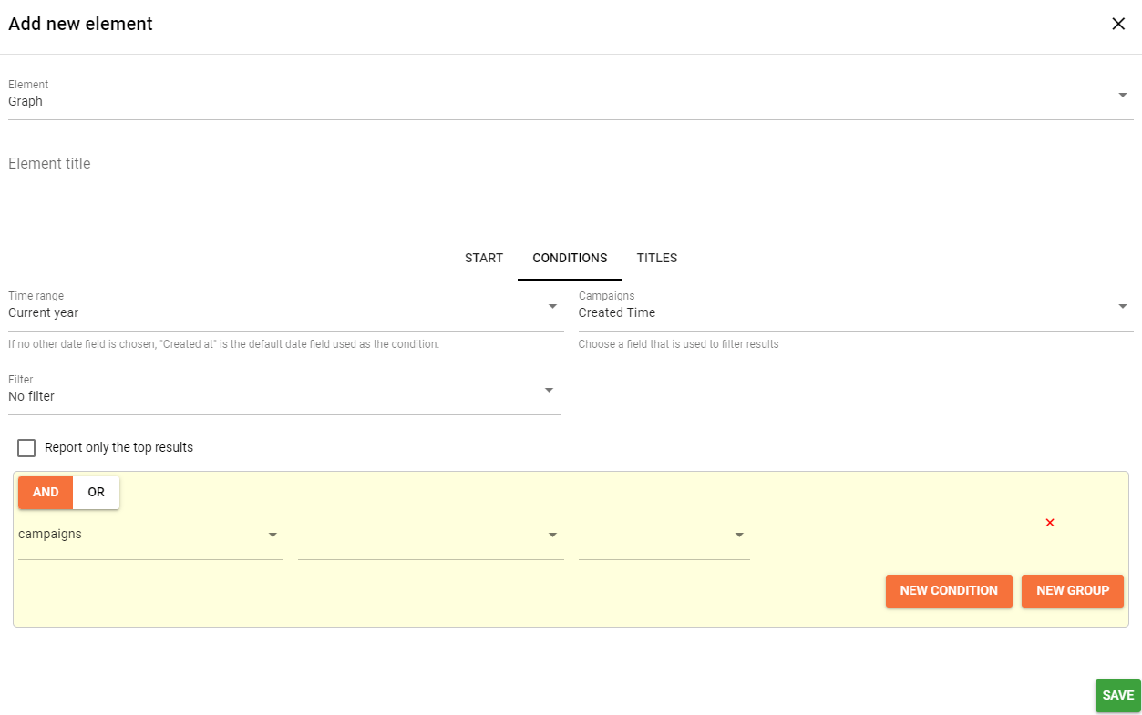
Conditions
The Conditions tab can then be used to further restrict the information that the chart displays. The drop-down menus define, among other things, date conditions, such as the time range of the data to be retrieved, the date field on which the data is retrieved, and so on. And/Orconditions can be used to specify any additional conditions for the data being retrieved. Conditions are defined using drop-down menus and unwanted conditions can be removed by pressing the small red x to the right of the condition.
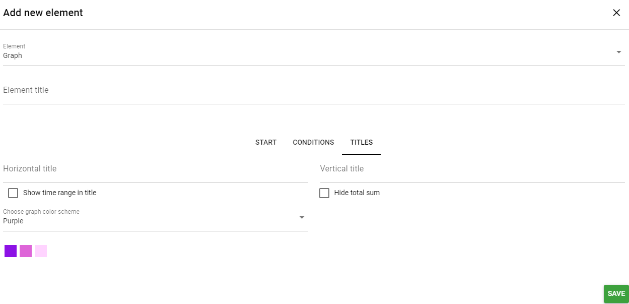
Titles
Finally, the Titles tab allows you to specify, among other things, the titles of the axes and the colour scheme of the graph. The available options vary depending on the selected chart.
Sharing the Charts
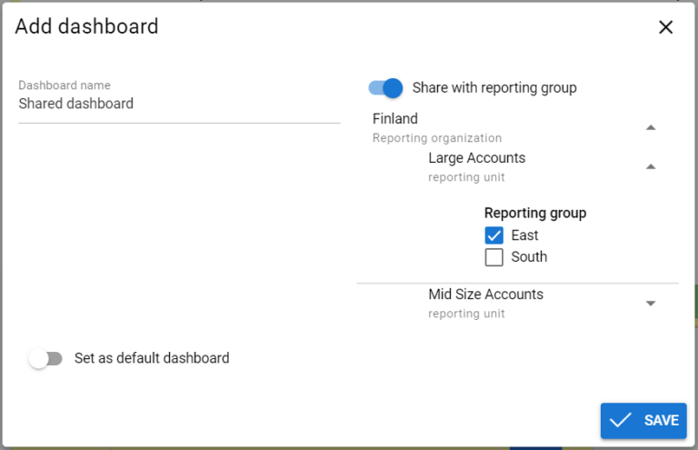
Sharing of a chart is always based on whether the dashboard is shared or not (see the picture below). Hence, if the chart is created to a dashboard that has been/will be shared with a reporting group, it is automatically available for the users in the reporting group according to their user rights.
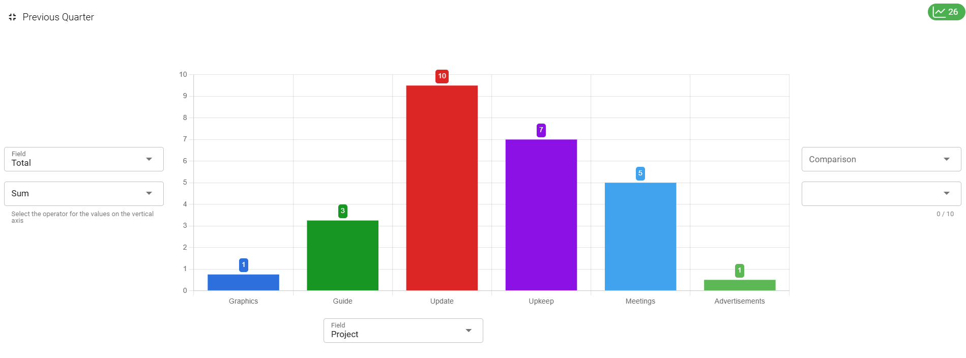
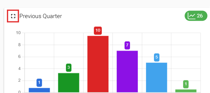
Full screen mode
Multiple graphs can also be viewed in full screen mode. This mode can be toggled on/off by using the Toggle full screen button in the top left corner of the graph (see picture below).
Full screen mode hides all other elements of the CRM. It is also a quick view mode, allowing users to edit the chart temporarily inside the full screen mode. None of the edits made this way are saved and the given options are limited, but this is an easy way to check information from different fields, etc. (see picture below).