General
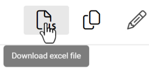
The CRM-service interface contains several different icons to perform different functions. The system is designed to be intuitive, so often the different buttons contain text that tells you what the button does. Textless icons usually tell you their purpose when you hover your mouse cursor over them (see picture below).
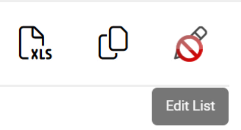
Some system icons are informative, but most of them perform some kind of action. If the system does not allow the user to perform this action, the mouse cursor will turn into a prohibition icon (see picture below).
The appearance of system icons is influenced by several factors, including their location and the system on which they are used. However, we have taken advantage of the general recognisability. While the icons below may not look identical to the icons in your system, similar symbols do the same things in your system.
Save & Cancel
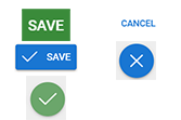
The system uses either text icons or the x and check mark icon (see picture below) for saving and cancelling. For notification boxes, the cancel icon is accompanied by an OK icon to acknowledge receipt of the notification.
Actions
The Actions button, aka the Module tool icon is found in almost all modules and is used to perform basic system functions. Such functions include things like sending emails or creating a mass event registration form. Besides module tools actions button is also used to access different types of functions like delete button.
The module tools used can be off-the-shelf system tools, but they can also be added to the system by the admin users. All available actions can be accessed by opening the entity card of the module and clicking on the Actions icon (see picture below), which will open a menu of available tools and other functions.
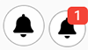
Notifications
The notifications symbol is a clock, and the icon is located in the top right corner of the system. If a user has unread notifications, a number box appears in the top right corner of the icon, indicating the number of unread notifications (image below). Notifications can be read and acknowledged from the pre-set pop-up menu, which opens by clicking on the icon.
History

Users
User icons are circles that contain either the user’s initials or the image assigned to the user (see picture below). The user icon in the top right of the system opens the exit menu, and the user icon can also be changed using the pencil icon.
User icons are also used for things like entity change logs, where the icon shows who made the change. If the change is not made by a user but by system automation, the user icon is replaced by a robot icon (see picture below).

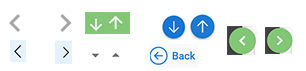
Arrow icons
Arrow icons are used to navigate the system (previous/next), organise content (ascending/descending) and hide content (show more/less). Arrow icons are also used to open menus.
Editing icons
Editing icons have the common feature that their symbol is a pen. An exception to this is the mass edit icon, which is a button with text (see picture below).
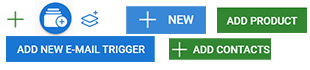
Icons for adding things
Adding things to the system is done with buttons, almost invariably with a plus sign or a text prompt. A plus sign and an icon or text may also be combined (see image below).
The first exception to the add buttons is the copy icon (see picture below). This standard icon is used in situations where a new thing, such as a filter, is created by making a copy of something and editing it.

Another exception to the add icons is the icons used to fill fields. For example, dates can often be filled in manually or by using the date selector, which opens by pressing the calendar icon (pictured below).

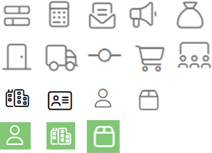
Fields can also be filled by attaching relations to the entity. In principle, it is not even possible to manually enter data in these fields, but by clicking on a field, a pop-up window opens with a list from which the user can select the desired relational field. For example, in the contact’s Supervisor field, the contact icon is displayed, so the field is filled by selecting the supervisor from the contact list.

The relation icon indicates which module the data is associated with (ID card for contacts, cardboard box for products, etc). On entity cards, the images are in black and white, but similar icons are also used in colour in the list view to indicate which module the data displayed in the list comes from (see picture below).
Delete icons
Deletion icons are mainly different types of garbage can icons or text buttons. The exception is the small x buttons, which are used for example, to delete data in the relation fields.
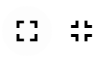
Toggle full screen
In some areas of the system you can see option to toggle full screen. When icon is used to expand the view, the icon is four tiny arrows pointing outwards, forming a square. When icon is used to minimize the full screen view, the icon is four tiny arrows pointing inwards, forming a plus (see picture below).